About

I am a current student at University of East London, studying Graphic Design and Printmaking. Art has been my passion ever since I discovered a pencil. I can’t place myself to a specific genre but if I absolutely had to it would be somewhere in between Graphic Design and Illustration. As a young artist I am still trying to define my style of work, so far I would describe it as accurate and delicate. I like to take great care of each piece and make sure it is produced to high quality or else it is not worth exposing to the world, I am definitely a perfectionist when it comes to my own work. Living in digital age it is hard to ignore all the amazing software, however I believe that handmade pieces are so much more valuable and precious compared to digital. It takes great determination to producing a handmade piece, making unintentional mistakes part of the work often leads to uniqueness, such work cannot be re produced which makes it very admirable. I guess I try to re bell against all the brand new techniques on purpose, because I like spending time on solving problems that could be corrected in no time on computer software. I get my inspiration from quite literally everywhere

Wednesday

LetterMpress: a virtual letterpress for the iPad

Borough & Lane

"Unknown" Evan Hecox 

"Battersea" Evan Hecox

stolen space gallery

Imaginary Menagerie

This exhibition took place at the text/gallery, a very small space but I feel like it was perfect for this typographic exhibition as all the works were very subtle. I guess that's the beauty of typography, it has a big impact in every day life but no one truly notices the small details in typefaces. 
As a viewer I was able to wonder around the exhibition in any direction, there was no particular way of viewing works or maybe there was an intention of leading viewers in a certain way but in a non obvious way.  There wasn't very much information provided about the pieces, so I had to research the ones I liked most online after the visit, despite that it was still a brilliant exhibition.  
I really liked all the works on display, the two that stood out most were pieces by Graham Bignell and Beatrice Bless called Mikado, this piece was screen printed the same typefaces in three different colours on top of each other and off set on purpose. I feel like it kind of relates to my own work, printing in four colour separation. Another piece was by Polina Pakhomova called promises, I thought the hand written type made this work much more personal and very strong as she layered sheets of paper on top of each other to create a three dimensional effect. 
After viewing this exhibition I was inspired to produce similar pieces to Pakhomova's work, that's where the text layering experimental piece came from in my sketchbook.
"Mikado" Graham Bignell & Beatrice Bless

"Promises" Polina Pakhomova

RA X: 10 years of Resident Advisor

This exhibition took place at the Kemistry Gallery, which showcased screen printed posters produced for an electronic music event in London by ten different artists. The space for this even was reasonably small, but there was no need for anything bigger as it created an intimate atmosphere between the viewer and these design pieces. I thought that all posters had an element of abstraction to them, there to represent the music and lure you in to attend the event. What was great about them is that they were all the same format, with exact same minimal layout the only parts that changed were rectangles in the middle. I think that small detail like the layout is a great way to tie a series of works together. All artists used screen printing as a way to produce these posters, which gave them this great feel of being one off and precious a limited edition of a kind.
One of my favourite pieces from this show was ‘RA X’ by Simon Cook , the use of layering left me examining the poster for a while and vibrant colour caught my eye straight away. As an event poster it definitely does the job of catching public eye. Another piece was ‘RA X’ by Michael Cina, also some very great detail and layers of bold black and perfect thin lines of colour; I still don’t know how he achieved such perfection. However I thought this poster might not of been as eye catching as the other one, but the craftsman ship was brilliant.
I have been inspired by some of these works to incorporate layering in my screen printing project, because it makes a piece of work look so much richer in tone and colour.

"RA X" Simon Cook 2011

"RA X" Michael Cina 2011

Friday

Postmodernism: Style and Subversion 1970-1990

I visited this featured exhibition at the Victoria and Albert Museum. It was great to see so many different artist works of postmodernism in one huge gallery space. As a viewer I felt blown away by the amount of different objects there were in this space, from flat 2D works such as posters to household objects, abstract sculptures, video and 3D simulations. The gallery space itself felt very postmodern, dark walls and dimmed lighting with neon signs leading the public from one room into the other. I think it’s really important to get the space itself right, to suit what is exhibited and V&A got it right spot on!
 There were soo many works that I liked it was hard to just pick a few to write about. An amazing poster by Paul Scher ‘The best of Jazz’ was one of them, my liking of typography and passion for the constructivism posters has drawn me to this particular piece. I like the simplicity of it, use of only three colours to screen print and the way it has been mostly concentrated on the type positioning of this promotional music poster. Another piece of work I like was ‘Orchid’ by Robert Mapplethrope, which is a ceramic plate with a black and white Orchid photo print. The perfectly round and thin plate it so elegant and minimal, seems like less is more when it comes to this piece. I also like the way photography has been taken out of its original context and has been applied to tangible object.
Overall I thought the exhibition gave me the real feel of postmodernism and I saw a lot of works that were new to me. Where some works were great I felt like others were a little over the top and there was too much going on at once. I think in the future I would like to try using some sort of untraditional media to display my work, for example traditional printing method transferred on to a tangible object which would never be associated with printmaking.

"The Best of Jazz" Paula Scher 1979

"Orchid" Robert Mapplethorpe 1989

Thursday

Mark Titchner: Three Minute Wonder

Sunday

David Mushegain: Don't Call It Cool

During the summer holiday I have visited Paris, and thought it would be a crime not to visit at least a few exhibitions during the short time I was there. 
This was a single photographers exhibition held in a well known spot to the younger crowd called Colette, this place is popular for selling exclusive streetwear brands, unique designer clothing as well as art and design books. This three floor space is like a melting pot of young culture, with a small gallery space tucked in right at the top of it all. I thought the atmosphere was perfect for this type of exhibition. As I was admiring these photographs I realised there was actually no information about who the people were and what this exhibition was all about until I reached the very end of it, where a small table stood with all the information leaflets. It seemed like the photographer wanted the viewer to make their own assumptions on who the subjects were and why they were photographed. And I was right, David Mushegain uses photography to document the people he meets on daily basis, people he finds fascinating and beautiful. 
For me the photograph that stood out most was with a man covered in tattoos, because more then likely that each piece of art on his body has a story behind it. I find it very interesting the way some of us choose to record certain events/ memories through out our lives in text and image on our own bodies. Its great the way he uses black and white photography to focus viewers concentration on the persons features, faults and perfections.
Over all I think this was a great exhibition, Mushegain has managed to capture each persons personality in one shot. Its also great to come across someone who can see each individual for what they really are, unique, in their own way beautiful human beings. 

David Mushegain, Unknown 2010-2011

David Mushegain, series of photos 2010-2011

David Mushegain, series of photos 2010-2011

Friday

Erika Lakatos: Roman Icons, New York - Budapest 1996 - 2011

This was another exhibition at the Hungarian House of Photography, single artists exhibits. All the work was displayed very simply, due to the complexity of the art itself. As a viewer I didn't feel informed well enough what the work was about, I had to do my own research on the techniques used to produce the images. The photographer works with polaroid images and applies a fine art touch to them by enlarging photgraphs and applying paint using a colourful pallet. Even though Lakatos work didn't appeal to me and left me feeling confuse, I still quite like the idea of working and re-arranging photographs by using different type of media on the image, creating unusual effects. Perhaps its something I could experiment with over the summer. My favourite piece of work out of the whole set was the image below, mostly because of its beautiful earthy colour scheme and soft marks of distortion. 

Erika Lakatos Untitled, 1996-2011

Sunday

Hungarian House of Photography: Róbert László Bácsi

This exhibition was showcasing works of five different Hungarian photographers, Róbert László Bácsi, András D. Hajdú, Dénes Mártonfai, Simon Móricz and Márk Simon, who reflect on social and political issues through Fine Art Photography. This exhibition was based on the top floor of a very old building, which is a photography gallery. Works were clearly displayed between three rooms/corridors, I felt like the best pieces were shown to the viewer first. As an observer I felt a little confused about some works as the text explanations around the gallery were in Hungarian, but I think most photographs speak well for themselves. 
I particularly admire Róbert László Bácsi photographs, who gives the viewer an insight into gloomy and grey Armenia. All of his photographs look very interesting, because of their dull and misty atmosphere. I have never been to Armenia myself but it is kind of what I imagine it to be like, and the photographer has done a very good job at visually communicating the county's state to the viewer. 
These photographs are not the kind you glance at and think "oh that's a lovely picture", they show us a country that used to be part of Soviet Union and who is still facing difficulties to this day. I think works like this need to be exposed a little more, so we get a better insight into smaller countries around the world. 


Saturday

Mysterious Al

This is a solo exhibition by Mysterious Al at the Stolen Space gallery, the exhibition space is not very big but its perfect for this style of work as the gallery is well known for hosting underground style illustrators and graphic designers. all works are thoughtfully laid out around the space, flat pieces were hung on the walls and there were two installations, a colourfully pained broken down garden shed and a small prayed space with crosses made out of wooden branches, candles, spray paint cans and an open bible with cut out pages with a marker pen placed inside. The whole exhibition is vibrant and humorous, which creates a great atmosphere to be in as a viewer. I thought the bible piece was quite successful, as it was an artists way of presenting his strong believes in graphic art by creating almost a shrine for his tools. Wood masks also really stood out for me, because of the way they were composed, layers of wooden pieces painted and carefully placed on top of each other to create a three dimensional effect. I would really like to take this technique into practice and make something similar to these masks in the future. 
Mysterious Al  Masks 2011

Mysterious Al  Pisstake 2011

British Art Show 7

This week I went to see a British Art Show exhibition which was based at the Southbank Centre. I think this is a perfect venue to host an exhibition filled with contemporary British art work, as the Southbank Centre has been used for Art's purposes since 1951 and to this day it looks like a modern piece of architecture.
Most art work's displayed around the exhibition spaces were very difficult to grasp, I felt confused and misguided for most of the time. Perhaps I am just not as open minded as I thought...However there were a few pieces that caught my attention, a video screening by Christian Marclay The Clocks and Luke Fowler Grammar for Listening (part 1). I was quite surprised of myself, as I don't usually find video pieces that interesting, but these ones were more like film.

Christian Marclay The ClocksThe screening was based in a dark room, where a 24 hour video was projected on to a big white wall like a small cinema. As the work is 24 hours long at first I was not sure what was going on on the screen, but after a few minutes I have started to realise that the video is created out of short clips from various film fragments which indicate a certain time. Basically what ever time it is right now, that will be the time in this video.
Watching this piece was incredibly interesting, I sat there for some time while hundreds of different narratives were flickering before my eyes. I think that's what makes it so interesting and timeless, because your mind wants to know what will happen in the next minute so you want to watch more and more. It seems that Marclay is trying to communicate the importance of time and how it can fly by without us noticing, while constantly being reminded about it.
From reading reviews and watching a BBC news report on Christian Marclay's The Clocks, this piece has left a very positive impression on critics and the public itself, everyone is recommending to take a peak at this brilliant work of art! Personally I couldn't agree more, seeing a small part of this film has left me mesmerised, I wanted to sit in that very uncomfortable chair for the whole of 24 hours.
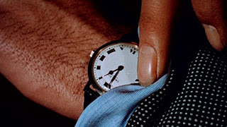
Still from Christian Marclay’s The Clock, 2010
Luke Fowler A Grammar for Listening (Part 1): Again the video was screened in a dark room with an even smaller screen, the film footage was shot with a 16mm camera which gave it lovely rounded edges and a vintage crackle look. The viewer is supposed to observe the video and listen to a separate sound file, which automatically encourages to question the communication between listening and looking. Personally I was overwhelmed with the calm and unnoticeable everyday noises that were complimenting the peaceful imagery on the screen, mostly because they were turned up to a very high volume which I was not used to. Sitting in the room became very uncomfortable due to the build up of the sounds, which was very strange because usually I barely notice them in my every day life. On the other hand the film was beautifully composed and I particularly enjoyed that part of the work.
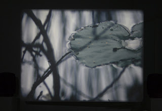
Still from Luke Fowler's A Grammar for Listening, 2009

Monday

John Stezaker

I have recently visited a single artist exhibition of John Stezaker at the Whitechapel Gallery. This artist composes collages by mainly using film stills combined with vintage postcards, the work is simply constructed but comes across very complex to the viewers eye. I myself was inspecting some of the pieces for at least few minutes, as the artist managed to combined two different images into one without any visible lines of collage. It felt like an optical illusion of the space and angles within a photograph. All the imagery used in Stezaker's work is recognizable from our every day lives and the viewer is there to observe and absorb the fascinating mix of old photographs and modern art work.
Looking at the individual series, the Untitled pieces of various film star images have been cut diagonally in half and carefully balanced together to create a distorted portrait. I thought this particular series is one of the most successful works. I think he was trying to show the public how simple it can be to make something beautiful ugly and distorted, the actresses back in them days were flawless and no one ever thought to imagine them looking this way. Another great series would be Mask, where he again uses film stills only this time placing postcards of very impressive nature imagery on top of the portrait. I see it as a comparison of beauty, a subliminal message of natural beauty within a woman. Not forgetting to mention the the precious worn out colours that vintage postcards hold, it really adds character to these works. I may be wrong about the message behind Stezaker's work, but that is how I have interpreted it after seeing the exhibition.
Over all this was a great exhibition to start my academic year with, it might be one of the best exhibitions i have been to in some time. Collaging is something I like to do myself and I have picked up a great deal of inspiration from John Stezaker's work, especially the photography part of it!

Mask XXXV 2007 (collage)
Untitled XX  2007 (Film Portrait Collage)

Tuesday

Wooden Toy Quarterly

This was a small pop-up exhibition at the Concrete Hermit Gallery, Wooden Toy Quarterly is essentially a magazine that features art work from mostly street artists and graphic designers. In this particular show they were featuring screen prints of Timba Smits, customised 12" vinyl's and selling their quarterly magazine editions. The gallery also has a shop, which sells street art, illustration and graphic design books so this exhibition was perfect for the chosen space. 
Work was presented in a a very original way, it felt like I was entering their personal shop as you could purchase the books that were on display and there was a cabinet with Wooden Toy Quarterly logo lit up from the inside which had the records hanging inside. The exhibition included an interactive piece, viewers had to push the button and one of the custom vinyl's span around on the wall display. I thought was great, pieces like that always make exhibitions more exciting and break it down from just looking at the work. My favourite pieces were the customised spray cans with gloomy colours, the illustration style was exactly what I am interested in at the moment. 
The atmosphere was vibrant and I was surrounded by so many reds, blues and wooden textures, it created a great mood and I just wanted to stay and observe pieces for as long as possible. After viewing this exhibition I felt like creating some of my own three-dimensional pieces and experimenting more with colour and textures. 
Over all it was a great experience its always nice to view the work I liked seeing online in real life, makes me appreciate it even more. 


Reverting to Type from Lima Charlie on Vimeo.

Reverting to Type

An exhibition of contemporary artists from all over the world coming together to show how old fashioned type is brought back in to our every day use at the Standpoint Gallery. All works confined in a small two room gallery space really came together, as most prints were small to medium size and not the standard paper shape they were thoughtfully scattered around the gallery's walls. I really enjoyed observing the works piece by piece, trying to figure out what methods were being used. There were no labels indicating printing methods, I guess the artists wanted it to turn in to an interactive display so viewers took time to notice and examine.
Most artists have used letterpress and screen printing as their main technique some merged lino cutting and digital print into their works. I thought Team Nerd and Prensa La Libertad had the most successful pieces, primarily because they had interesting combinations of printing techniques as well as blending typography and colour. The idea that this exhibition was based on was clearly shown by all the pieces, we see letterpress and other print methods being introduced in to posters and advertising campaigns everyday.
I was amazed by how this simple old craft method has been around for centuries and yet it is only being re-born now, every single letter looked perfect even if it wasn't filled completely with ink. With all the new printing technology it is easy to forget how precious the manually printed pieces can look. This exhibition has inspired me to begin using letterpress in my own work, I hope to one day produce pieces as high quality as these!

Red Star Over Russia

An especially dedicated show room to Soviet Era posters at Tate Modern. This small room has definitely become my favourite out of all of the modern art filled spaces in the Museum. I have always been a fan of Soviet poster art as it has one of a kind style and the modern look they have to the time when they were produced is extraordinary. 
As the viewer I felt like I was there to observe and soak in the vibe of what people of Soviet Russia felt during the October Revolution in 1917. Being able to read the text and understand the phrases has given me more knowledge about the work. It was clear that people united to produce these posters despite the hard times, they wanted to show the communal power by using simple printing techniques with bold text and imagery. The room is filled with works from floor to ceiling, so in a way you are being surrounded by all the messages without consciously realising. 
Once I have looked at all the pieces, I felt curious of what printmaking was like back then and whether following the old fashioned method of printing is better rather then developing short-cuts or using hight technology equipment to produce prints. This work has thought me to appreciate the original printmaking methods a little more. It was great to see a piece of  history presented in graphic design form.