About

I am a current student at University of East London, studying Graphic Design and Printmaking. Art has been my passion ever since I discovered a pencil. I can’t place myself to a specific genre but if I absolutely had to it would be somewhere in between Graphic Design and Illustration. As a young artist I am still trying to define my style of work, so far I would describe it as accurate and delicate. I like to take great care of each piece and make sure it is produced to high quality or else it is not worth exposing to the world, I am definitely a perfectionist when it comes to my own work. Living in digital age it is hard to ignore all the amazing software, however I believe that handmade pieces are so much more valuable and precious compared to digital. It takes great determination to producing a handmade piece, making unintentional mistakes part of the work often leads to uniqueness, such work cannot be re produced which makes it very admirable. I guess I try to re bell against all the brand new techniques on purpose, because I like spending time on solving problems that could be corrected in no time on computer software. I get my inspiration from quite literally everywhere

Saturday

Mysterious Al

This is a solo exhibition by Mysterious Al at the Stolen Space gallery, the exhibition space is not very big but its perfect for this style of work as the gallery is well known for hosting underground style illustrators and graphic designers. all works are thoughtfully laid out around the space, flat pieces were hung on the walls and there were two installations, a colourfully pained broken down garden shed and a small prayed space with crosses made out of wooden branches, candles, spray paint cans and an open bible with cut out pages with a marker pen placed inside. The whole exhibition is vibrant and humorous, which creates a great atmosphere to be in as a viewer. I thought the bible piece was quite successful, as it was an artists way of presenting his strong believes in graphic art by creating almost a shrine for his tools. Wood masks also really stood out for me, because of the way they were composed, layers of wooden pieces painted and carefully placed on top of each other to create a three dimensional effect. I would really like to take this technique into practice and make something similar to these masks in the future. 
Mysterious Al  Masks 2011

Mysterious Al  Pisstake 2011

British Art Show 7

This week I went to see a British Art Show exhibition which was based at the Southbank Centre. I think this is a perfect venue to host an exhibition filled with contemporary British art work, as the Southbank Centre has been used for Art's purposes since 1951 and to this day it looks like a modern piece of architecture.
Most art work's displayed around the exhibition spaces were very difficult to grasp, I felt confused and misguided for most of the time. Perhaps I am just not as open minded as I thought...However there were a few pieces that caught my attention, a video screening by Christian Marclay The Clocks and Luke Fowler Grammar for Listening (part 1). I was quite surprised of myself, as I don't usually find video pieces that interesting, but these ones were more like film.

Christian Marclay The ClocksThe screening was based in a dark room, where a 24 hour video was projected on to a big white wall like a small cinema. As the work is 24 hours long at first I was not sure what was going on on the screen, but after a few minutes I have started to realise that the video is created out of short clips from various film fragments which indicate a certain time. Basically what ever time it is right now, that will be the time in this video.
Watching this piece was incredibly interesting, I sat there for some time while hundreds of different narratives were flickering before my eyes. I think that's what makes it so interesting and timeless, because your mind wants to know what will happen in the next minute so you want to watch more and more. It seems that Marclay is trying to communicate the importance of time and how it can fly by without us noticing, while constantly being reminded about it.
From reading reviews and watching a BBC news report on Christian Marclay's The Clocks, this piece has left a very positive impression on critics and the public itself, everyone is recommending to take a peak at this brilliant work of art! Personally I couldn't agree more, seeing a small part of this film has left me mesmerised, I wanted to sit in that very uncomfortable chair for the whole of 24 hours.
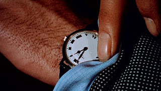
Still from Christian Marclay’s The Clock, 2010
Luke Fowler A Grammar for Listening (Part 1): Again the video was screened in a dark room with an even smaller screen, the film footage was shot with a 16mm camera which gave it lovely rounded edges and a vintage crackle look. The viewer is supposed to observe the video and listen to a separate sound file, which automatically encourages to question the communication between listening and looking. Personally I was overwhelmed with the calm and unnoticeable everyday noises that were complimenting the peaceful imagery on the screen, mostly because they were turned up to a very high volume which I was not used to. Sitting in the room became very uncomfortable due to the build up of the sounds, which was very strange because usually I barely notice them in my every day life. On the other hand the film was beautifully composed and I particularly enjoyed that part of the work.
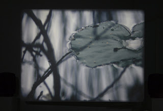
Still from Luke Fowler's A Grammar for Listening, 2009

Monday

John Stezaker

I have recently visited a single artist exhibition of John Stezaker at the Whitechapel Gallery. This artist composes collages by mainly using film stills combined with vintage postcards, the work is simply constructed but comes across very complex to the viewers eye. I myself was inspecting some of the pieces for at least few minutes, as the artist managed to combined two different images into one without any visible lines of collage. It felt like an optical illusion of the space and angles within a photograph. All the imagery used in Stezaker's work is recognizable from our every day lives and the viewer is there to observe and absorb the fascinating mix of old photographs and modern art work.
Looking at the individual series, the Untitled pieces of various film star images have been cut diagonally in half and carefully balanced together to create a distorted portrait. I thought this particular series is one of the most successful works. I think he was trying to show the public how simple it can be to make something beautiful ugly and distorted, the actresses back in them days were flawless and no one ever thought to imagine them looking this way. Another great series would be Mask, where he again uses film stills only this time placing postcards of very impressive nature imagery on top of the portrait. I see it as a comparison of beauty, a subliminal message of natural beauty within a woman. Not forgetting to mention the the precious worn out colours that vintage postcards hold, it really adds character to these works. I may be wrong about the message behind Stezaker's work, but that is how I have interpreted it after seeing the exhibition.
Over all this was a great exhibition to start my academic year with, it might be one of the best exhibitions i have been to in some time. Collaging is something I like to do myself and I have picked up a great deal of inspiration from John Stezaker's work, especially the photography part of it!

Mask XXXV 2007 (collage)
Untitled XX  2007 (Film Portrait Collage)

Tuesday

Wooden Toy Quarterly

This was a small pop-up exhibition at the Concrete Hermit Gallery, Wooden Toy Quarterly is essentially a magazine that features art work from mostly street artists and graphic designers. In this particular show they were featuring screen prints of Timba Smits, customised 12" vinyl's and selling their quarterly magazine editions. The gallery also has a shop, which sells street art, illustration and graphic design books so this exhibition was perfect for the chosen space. 
Work was presented in a a very original way, it felt like I was entering their personal shop as you could purchase the books that were on display and there was a cabinet with Wooden Toy Quarterly logo lit up from the inside which had the records hanging inside. The exhibition included an interactive piece, viewers had to push the button and one of the custom vinyl's span around on the wall display. I thought was great, pieces like that always make exhibitions more exciting and break it down from just looking at the work. My favourite pieces were the customised spray cans with gloomy colours, the illustration style was exactly what I am interested in at the moment. 
The atmosphere was vibrant and I was surrounded by so many reds, blues and wooden textures, it created a great mood and I just wanted to stay and observe pieces for as long as possible. After viewing this exhibition I felt like creating some of my own three-dimensional pieces and experimenting more with colour and textures. 
Over all it was a great experience its always nice to view the work I liked seeing online in real life, makes me appreciate it even more. 


Reverting to Type from Lima Charlie on Vimeo.

Reverting to Type

An exhibition of contemporary artists from all over the world coming together to show how old fashioned type is brought back in to our every day use at the Standpoint Gallery. All works confined in a small two room gallery space really came together, as most prints were small to medium size and not the standard paper shape they were thoughtfully scattered around the gallery's walls. I really enjoyed observing the works piece by piece, trying to figure out what methods were being used. There were no labels indicating printing methods, I guess the artists wanted it to turn in to an interactive display so viewers took time to notice and examine.
Most artists have used letterpress and screen printing as their main technique some merged lino cutting and digital print into their works. I thought Team Nerd and Prensa La Libertad had the most successful pieces, primarily because they had interesting combinations of printing techniques as well as blending typography and colour. The idea that this exhibition was based on was clearly shown by all the pieces, we see letterpress and other print methods being introduced in to posters and advertising campaigns everyday.
I was amazed by how this simple old craft method has been around for centuries and yet it is only being re-born now, every single letter looked perfect even if it wasn't filled completely with ink. With all the new printing technology it is easy to forget how precious the manually printed pieces can look. This exhibition has inspired me to begin using letterpress in my own work, I hope to one day produce pieces as high quality as these!

Red Star Over Russia

An especially dedicated show room to Soviet Era posters at Tate Modern. This small room has definitely become my favourite out of all of the modern art filled spaces in the Museum. I have always been a fan of Soviet poster art as it has one of a kind style and the modern look they have to the time when they were produced is extraordinary. 
As the viewer I felt like I was there to observe and soak in the vibe of what people of Soviet Russia felt during the October Revolution in 1917. Being able to read the text and understand the phrases has given me more knowledge about the work. It was clear that people united to produce these posters despite the hard times, they wanted to show the communal power by using simple printing techniques with bold text and imagery. The room is filled with works from floor to ceiling, so in a way you are being surrounded by all the messages without consciously realising. 
Once I have looked at all the pieces, I felt curious of what printmaking was like back then and whether following the old fashioned method of printing is better rather then developing short-cuts or using hight technology equipment to produce prints. This work has thought me to appreciate the original printmaking methods a little more. It was great to see a piece of  history presented in graphic design form.