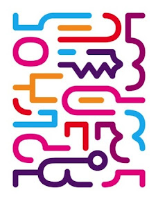
Pick Me Up is a graphic art festival, filled with may upcoming talented artists, printmakers and designers. Held right by the river bank at Somerset House, it has been a kicking off the perfect start to sprint for the past few years. I haven't noticed much change in terms of layout of the exhibition from last year, I guess its all about viewing the works and taking part of workshops, the layout itself doesn't play a big part in the exhibition as such. This year I saw quite a few new featured artists and the exhibition, who are worth keeping an eye out for, such as Malarky and Hettie Stewart. Both artists have a unique style and a lot of vibrancy going on in their works. While Hettie Stewarts's works are more paper based, Malarky is out and about on the streets making London a more colourful place.
About
Thursday
Pick Me Up: Graphic Art Festival
Posted by Julia Baranova at 2:24 PM
Wednesday
a_show: Austrian Architecture
This is a permanent exhibition based on Austrian architecture in 20th and 21st Centuries. The exhibition took place in a specially dedicated space for architecture at the MuseumsQuartier (Museum Square), I thought this multicultural space was great for such exhibition. Its the best way to familiarise yourself with surrounding buildings and their history if you are new to the city. In the gallery space a viewer is there to be an observer, however there were a lot of books and information provided in order to enlighten viewers knowledge of the exhibits.
A lot of architecture was taken from the modernist movement, at the beginning of the 20th Century modernism started to evolve due to technological advances and changes in society. All buildings were simplified and stripped from the decorative details, with various geometric shapes introduced. This particular architectural movement is one of my favourites, mostly because I believe an architectural structure looks at its best in a simple form and when able to preform the given purpose. While looking around the gallery I tried to pick out parts of design that are useful to my practise, the two works that caught my eye were a car advertisement poster which used some lovely typography and beautiful illustrations, and a cover of an architecture journal, very minimal composition and great use of type with photography.
After viewing this exhibition, I really wanted to explore the city and find some of the buildings to view them in person. During our trip we managed to find two architectural pieces around the city, and they looked magnificent in real life.
The Typopassage Vienna
Posted by Julia Baranova at 2:16 PM
Thursday
MacDonald Gill - Maps
Posted by Julia Baranova at 2:18 PM
Google - Web Lab
Google Web Lab was a cross discipline exhibition, held at the Science Museum. I found the atmosphere of this exhibition very exciting, and I could see how it brought out children in adults. At the entrance you have to go up to a tiny machine which gives you a card at the press of a button, each card is different with colourful geometric shapes on it. This card is provided in order to operate the instruments and other interactive objects at the exhibition. As a viewer I felt really involved in the show, and wanted to try all the different innovations Google has offered us. I thought it was great the way people on the other side of the world were being filmed or were controlling some of the interactive objects via internet. It was great to see art being mixed with technology and science, and people being excited about scientific and technological experiments.
One of my favourite pieces was the musical machine, where you could produce music by connecting various coloured dots on the screen, each dot represented and instrument that was boxed in a see through container in front of you.
Overall I thought this exhibition was a great success, very inspirational and fun.
Posted by Julia Baranova at 2:12 PM
New York Kings
Posted by Julia Baranova at 2:07 PM
Obey - Sound & Vision
Posted by Julia Baranova at 2:02 PM


.jpeg)
.jpeg)
.jpeg)
.jpeg)


